Urban Ecosystem

A Spatial Analysis of Urban Color Harmony in Five Global Metropolises

  • CHEN Naige , 1, 2 ,
  • XU Xiaofan 1, 2 ,
  • TAN Minghong , 1, 3, * ,
  • WANG Xianming 4
Expand
  • 1. Key Laboratory of Land Surface Pattern and Simulation, Institute of Geographic Sciences and Natural Resources Research, Chinese Academy of Sciences, Beijing 100101, China
  • 2. College of Resources and Environment, University of Chinese Academy of Sciences, Beijing 100049, China
  • 3. International College, University of Chinese Academy of Sciences, Beijing 100049, China
  • 4. Natural Resources and Planning Bureau of Heze, Heze, Shandong 274000, China
* TAN Minghong, E-mail:

CHEN Naige, E-mail:

Received date: 2021-07-16

  Accepted date: 2021-10-08

  Online published: 2022-03-09

Supported by

The Strategic Priority Research Program of Chinese Academy of Sciences(XDA20040400)

Abstract

Harmonious urban color can reduce urban light pollution, relieve the urban heat island effect, improve the living quality and form a distinctive style. However, due to the manifold architectural styles, urban color in metropolises typically becomes complicated, which may destroy the color harmony of metropolises. Up to now, there has not been enough research on the quantitative expression of the degree of color harmony, and the research on comparing the urban color characteristics of different metropolises is also relatively insufficient. This paper firstly developed a method to quantitatively measure the degrees of color harmony (DCHs) of five metropolises in 2020: London, Tokyo, Chicago, Paris, and Beijing, by writing a Python program and using the Sentinel-2A remote sensing data. GIS buffers were then used to analyze the spatial distribution of the DCHs within each metropolis. In addition, 20 typical samples were selected to analyze the differences of the DCHs between residential and industrial areas. The results showed that: (1) The values of the DCHs of London and Tokyo were the highest, followed by Chicago and Paris, while Beijing was the lowest. (2) The values of the DCHs were increasing from the inside out in Chicago, Paris, and London, while those in Beijing and Tokyo were decreasing. (3) The values of the DCHs in industrial areas were much lower than in residential areas. Based on the above results, policy implications are provided for color management of these metropolises. Lastly, this study may provide a method for the rapid analysis the DCHs for other metropolises.

Cite this article

CHEN Naige , XU Xiaofan , TAN Minghong , WANG Xianming . A Spatial Analysis of Urban Color Harmony in Five Global Metropolises[J]. Journal of Resources and Ecology, 2022 , 13(2) : 238 -246 . DOI: 10.5814/j.issn.1674-764x.2022.02.007

1 Introduction

The metropolis, an integrated urban area consisting of one or more central cities and many towns within commuting distance (da Cruz and Choumar, 2020), has become a key economic and political center of a country. In order to increase competitiveness, many metropolises have started to create attractive cityscapes, of which urban color becomes one of the important parts. Urban color is composed of the perceptible color of all visual objects within the city, including artificial and natural colors, such as buildings, roads, parks, and green areas (Boeschenstein, 1986). Harmonious urban color has various functions. A soft color combination can reduce urban light pollution (Jones and Harris, 2012; Pawson and Bader, 2014). A light color combination can relieve the urban heat island effect, such as the color experiment in Athens, which reduced the experimental temperature by 7.7 ℃ after the color of the concrete was changed from black to white (Taha et al., 1988; Qi et al., 2019). Well-ordered color can produce a harmonious landscape to improve the living quality of urban residents (Cooper et al., 1986; Elliot and Maier, 2007), and fashionable color can form a distinctive style (Bian, 2018).
Due to globalization, new schools of architects abroad are bringing different architectural styles into metropolises. These new styles are very different from the traditional ones, which makes the buildings of metropolises include more color combinations (Sklair, 2005). However, too many color combinations and styles increase the difficulty of color management, and cause many urban color problems, such as the incongruous articulation between architecture and natural colors, the confusion of architectural color, including too many types of color matching and large variations in the use of color, which may destroy the color harmony of the metropolis (Wang, 2014).
In order to solve these problems, many scholars have investigated the urban color of metropolises. So far, these investigations have mainly focused on three fields. First, some studies concern the evolution of urban color in typical metropolises and its influencing factors, including the natural environment, the city’s history and culture, and the governmental policies and regulations (Ozaki, 1997; Fang and Li, 2017; Faire and McHugh, 2019). Second, a few studies have completed chromatographic studies of urban color and created databases of standards for the use of architectural color through field investigations and photographs (Tsai, 2006; Wang et al., 2010; Gou, 2013; Jechow et al., 2020). These standards constrain the use of urban color to reduce the conflicts between disharmonious colors. Third, some studies investigate residents’ perceptions of urban color and determine the preferences of color among residents of different genders, age groups, education levels and occupations by interview surveys and questionnaires, which will help the urban color to better serve the citizens (Wang et al., 2020).
However, by summarizing the existing studies, we found that there are three major deficiencies in them. First, studies on the color harmony of a whole metropolis are still lacking, which may lead to an incomplete understanding of urban color harmony. Second, the data used for these studies typically include photos or survey data, but there are few studies that use satellite remote sensing data to investigate the degree of color harmony. The use of satellite remote sensing data with a broader range of urban colors may improve the methodology of urban color investigation. Third, the previous studies of urban color mainly focus on one metropolis, while comparative studies of urban color among several metropolises are rare (Gou and Wang, 2008). Such comparative studies may deepen our understanding of urban color in different metropolises. Therefore, it is necessary to investigate the degree of color harmony (DCH) of the whole metropolis and conduct comparative studies of different metropolises by using high-resolution satellite remote sensing images (Jiao, 2001).
In this study, we took the five international metropolises of Paris, Tokyo, Chicago, London, and Beijing as study areas and compared their DCHs in 2020, based on Sentinel-2A remote sensing data with a spatial resolution of 10 m. First, we developed a new method to quantitatively measure the DCHs of the five metropolises by writing a Python program. Then, we analyzed the spatial distribution of the DCHs of each of the different metropolises, and compared the differences in the DCHs between the residential and industrial areas, considering their vast differences in DCHs. Lastly, the policy implications for color management are provided. Our study will give a definition of urban color harmony based on remote sensing images and provide a rapid calculation method for comparing color harmony across multiple metropolises, which will help to expand color harmony studies through the quantitative measurement of the DCHs.

2 Study areas, data sources, and methods

2.1 Study areas

The downtowns of London, Paris, Tokyo, Beijing, and Chicago were selected as the study areas, based on a few considerations. According to the 2020 global city report of the Globalization and World Cities Research Network world (https://www.lboro.ac.uk/gawc/world2020t.html), a report ranking the degree of globalization of cities by the number of network connections, these five selected metropolises are highly globalized with very internationalized architectural styles, which may lead to more color problems. In addition, these metropolises have large residential and tourist populations with a high demand for color harmony, which has led to urban color planning in the past (Table 1). The analysis of the selected metropolises can improve the existing urban color management field.
Table 1 Urban color planning of the selected metropolises
Metropolis Period Planning
Paris 1960s Completing color plans for the Greater Paris area and selecting beautiful beige as the base tone
Tokyo 1970s Conducting a comprehensive color survey on Tokyo and developing the first urban color plan with modern significance
Chicago 1970s Chicago is defined by a dark color tone, which corresponds to the cold temperament of its financial capital
London 1980s The dark blue was selected as the color of the buildings on both sides of the Thames River, and is suitable for the river water background after considering the environmental background
Beijing 2000s Beijing introduced the “Regulations on the Management of the Facade of Buildings in Beijing to Keep Tidy and Clean”, and began the urban color management work

2.2 Data sources

We chose the Sentinel-2A remote sensing images released by the European Space Agency (ESA) as the data source (https://scihub.copernicus.eu/dhus/#/home). The Sentinel- 2A data has high spatial resolution (10 m) and we can extract the color of the features more clearly. In order to reduce the data errors of Sentinel-2A data (cloud cover, seasonal color), all Sentinel-2A remote sensing images selected for this paper were from the summer of 2020 (June to September) with 0% cloud cover. The downtown boundaries of the selected metropolises came from the 2015 Global Urban Boundary dataset released by Professor Gong Peng’ group at Tsinghua University (http://data.ess.tsinghua.edu.cn/). Based on multiple remote sensing data, the group used cellular automata to extract the global urban boundary, and the accuracy of results is higher than 0.8 in all urban regions of the world (Li et al., 2020). The administrative boundaries of the selected metropolises came from the Diva-GIS website (http://www.diva-gis.org/gdata). Other planning information came from relevant books and literature.

2.3 Study methods

We used color differences to express the DCH. For example, a combination of two colors with large differences will give a feeling of abruptness, while a combination of two colors with small differences gives a feeling of harmony. Based on this definition, we calculated the DCHs of each metropolis. The calculation model of the DCH was developed based on the pixel values of the different bands of remote sensing images, which are derived from the reflectance of light by ground objects and contains the spectral information of those ground objects (Elachi and Zimmerman, 1988; Weiss et al., 2020). In this study, bands 2, 3 and 4 of the Sentinel-2A data were used, which represent blue, green and red light, respectively (the RGB color model).

2.3.1 The calculation model of the DCH

The calculation model of the DCH includes three steps.
(1) We processed the Sentinel-2A data by radiometric correction and geometric correction to reduce system errors, and extracted band 2 (blue), band 3 (green), and band 4 (red) to obtain the pixel values. In consideration of increasing the accuracy, we chose a 16-bit pixel that represents the color more accurately, and the pixels with abnormal values ​​(over black, over white) were eliminated.
(2) We used Python to set up a 490 m×490 m grid window to calculate the DCH of a pixel and its background (the grid window). As shown in ① in Fig. 1, the green square is the pixel to be calculated, and the red square is the background. Then, we calculated the standard deviation (SD) of the pixel value in the window by the average value (AV), and obtained the average standard deviation of the three bands to calculate the DCH (Equation 1-3). Lastly, as shown in ② and ③, we started a traverse calculation with a pixel length to get the DCH of the whole area.
$AV = \frac{1}{{{m^2}}}\mathop \sum \limits_{i = 1}^m \mathop \sum \limits_{j = 1}^m {c_{ij}}$
$SD = \sqrt {\frac{1}{{{m^2}}}\mathop \sum \limits_{i = 1}^m \mathop \sum \limits_{j = 1}^m {{\left( {{c_{ij}} - AV} \right)}^2}}$
$DCH = \frac{{S{D_r} + S{D_g} + S{D_b}}}{3}$
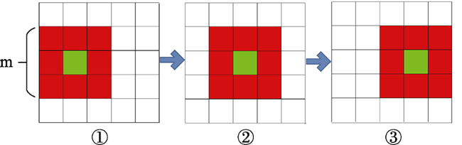
Fig. 1 Traverse algorithm calculation sketch map
where m is the number of rows and columns of the calculated window; ${c_{ij}}$ is the pixel value of row i and column j; and $S{D_r}$, $S{D_g}$, $S{D_b}$ represent the window standard deviations of the red, green, and blue bands. The greater the standard deviation of the pixel values, the greater the difference in urban color, which means a lower degree of color harmony.
(3) To define a standard for the comparison of the urban colors in different metropolises, we unified the DCHs of the five metropolises and ranked them from the smallest to the largest. The DCHs were then divided into four levels representing different levels of the color harmony from 0-100% with a gradient of 25% (Table 2), and the percentages of the pixels for the different levels in each metropolis were calculated.
Table 2 Harmony level classification
Percentage range (%) Numerical range Harmony level
0-25 <0.078 Highly harmonious
25-50 0.078-0.104 Generally harmonious
50-75 0.104-0.141 Generally disharmonious
75-100 >0.141 Highly disharmonious

2.3.2 Calculation of the DCH in different buffers

We used GIS buffers to analyze the spatial distribution of the DCHs from the inside out in the metropolises. Considering that buffers should contain as many urban areas as possible and avoid too much blank space, we took the center of the metropolis as the origin and delineated six buffers with a width of 5 km (Fig. 2), and calculated the percentage of the DCHs for each of the different levels in each buffer.
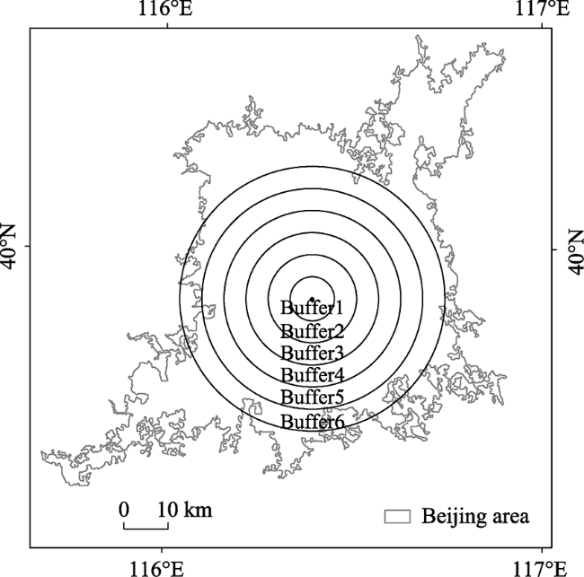
Fig. 2 Buffer analysis diagram (taking Beijing as an example)

2.3.3 Calculation of regional differences of the DCH

To analyze the regional differences of the DCH, two typical residential areas and two typical industrial areas were selected for each metropolis. In order to select the typical areas, we searched the maps of each metropolis on the official websites (taking London as an example, https://visitlondon.com/), and selected the large residential and industrial areas in each metropolis that were representative of the urban color with the sub-meter level data from Google Earth. The locations and photos of selected areas from Google Earth are shown in Fig. 3. Finally, the percentages of the DCHs of the different levels in each area were calculated.
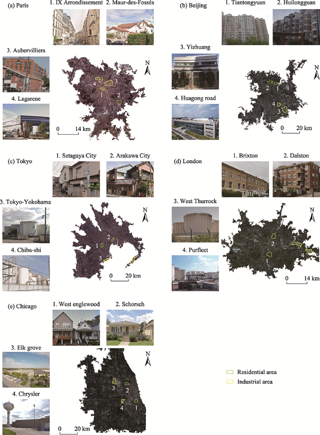
Fig. 3 Locations and names of selected industrial and residential areas for the five metropolises

3 Results

3.1 Comparison of urban color harmony

The results showed that there were differences in the DCHs between the selected metropolises (Fig. 4). The DCHs of London and Tokyo were the highest, with over 60% harmonious pixels, and the highly harmonious pixels were as high as 50% for London and 31% for Tokyo. The DCH of Beijing was the lowest with 24% harmonious pixels, of which only 8% were highly harmonious pixels. The DCHs of Paris and Chicago were in the middle with nearly 50% harmonious pixels.
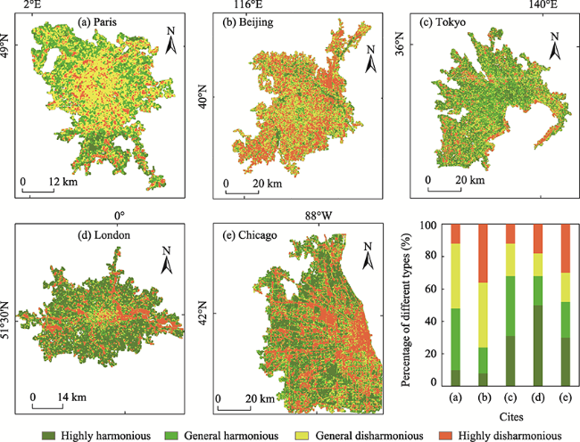
Fig. 4 Spatial distributions of different harmony levels
The spatial distributions of highly disharmonious pixels varied across the metropolises. In both London and Tokyo, the highly disharmonious pixels were distributed along the water bodies. The highly disharmonious pixels of London were mainly distributed in the part of the Thames River, and those of Tokyo were mainly distributed along the coastline. On the contrary, in Chicago and Beijing, the highly disharmonious pixels were distributed around transportation facilities. The highly disharmonious pixels of Chicago were mainly distributed on both sides of the railway in a radial pattern, while those of Beijing are distributed in the Suburban areas, with more around Beijing Capital International Airport in the northeast and Daxing International Airport in the south.

3.2 The DCHs in different buffers

The results showed that the changes in buffers were similar for Paris, Chicago, and London. The DCHs increased from buffer 1 to 6 in these metropolises, indicating that the color was more harmonious from the inside out (Fig. 5). In contrast, the DCH of Beijing was higher in the first buffer than in the other buffers, indicating that that color was relatively harmonious in the center of the metropolis and disharmonious in other areas. The change in the buffers of Tokyo was similar to that of Beijing, but the DCH of Tokyo was much higher than Beijing, with more than 60% harmonious pixels in all circles.
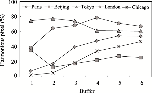
Fig. 5 Changes of the percentage of harmonious pixels in different buffers

3.3 Differences in the DCHs between residential and industrial areas

The results showed that the values of DCHs in the residential areas were much higher than in the industrial areas. The selected residential areas had 57.9% harmonious pixels and 11.8% highly disharmonious pixels, while the industrial areas had 4.2% harmonious pixels and 71.4% highly disharmonious pixels (Table 3). In addition, the DCHs of residential areas in different metropolises were different. The DCHs of typical residential areas in Tokyo was highest, with 97% harmonious pixels, including 91.5% highly harmonious pixels in Arakawa City. The values of the DCHs of typical residential areas in Beijing were the lowest, with 24% harmonious pixels, including only 16.3% harmonious pixels in Tiantongyuan Community. Lastly, the values of DCHs in the industrial areas were less variable between the different metropolises (Fig. 6).
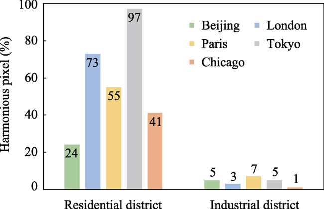
Table 3 Percentages of different harmony levels in residential and industrial areas
Metropolis Regional type Area number Class type (%)
Highly harmonious Generally harmonious Generally disharmonious Highly disharmonious
Paris Residential 1 0.2 48.1 44.7 7.0
2 0.3 60.8 37.7 1.2
Industrial 3 0.1 13.0 65.8 21.1
4 0 1.6 57.8 40.6
Beijing Residential 1 0 16.3 55.2 28.5
2 2.2 30.3 56.2 11.3
Industrial 3 1.3 3.4 22.5 72.8
4 0 5.5 35.8 58.7
Tokyo Residential 1 29.2 66.4 4.3 0.1
2 91.5 6.6 1.9 0
Industrial 3 0.1 7.7 29.1 63.1
4 0 2.1 22.4 75.5
London Residential 1 35.1 39.9 18.7 6.3
2 44.2 26.2 15.2 14.4
Industrial 3 0.8 2.8 1.9 94.5
4 0.7 2.0 5.5 91.8
Chicago Residential 1 3.9 25.9 44.9 25.3
2 7.1 44.6 24.4 23.9
Industrial 3 0.2 0.3 1.5 98.0
4 0 0 1.6 98.4

Note: Area number corresponds to the numbers of the selected areas of five metropolises in Fig. 3.

Fig. 6 Average percentages of harmonious pixels in selected regions

4 Discussion

According to the above results, three policy implications are provided for the color management of the selected metropolises.
(1) Beijing should pay more attention to the color harmony of the whole metropolis.
Our study showed that the value of DCHs in Beijing was the lowest among the five metropolises. The areas with disharmonious color were mainly distributed in the outer buffers of Beijing, while the inner buffers of Beijing were more harmonious. Other studies have also obtained similar results on the urban color of Beijing. Hu (2014) investigated the old city of Beijing by field survey and discovered that the color was harmonious and unified, due to the effective combination of yellow for the royal building color and simple grey for the residential building color. The color management was also better in the old city compared with the rapidly developing new areas, such as in the use of architectural color (Zhao, 2006). Now, Beijing is paying attention to color harmony. In 2020, the Beijing Planning Bureau proposed the new Beijing urban Design Guidelines, which provided detailed regulations and divisions for the use of color. But this regulation started late, and the content was more focused on the role of the core areas. The color harmony of the whole metropolis still needs to be improved. Therefore, we suggest that when formulating relevant color management, Beijing can add a new indicator for the degree of color harmony and specify the range of the indicator according to the overall color characteristics. At the same time, Beijing can learn from Tokyo, which has a similar cultural background. In Tokyo, less high-saturation color is used for the design of architecture to reduce the conflict between architectural color and its background, and the color of the new buildings, facilities, and landscapes is designed in accord with the function in different areas.
(2) Color harmony should be improved in the redevelopment of old buildings in London, Chicago and Paris.
Some studies have shown that urban color in the center of a metropolis is protected and managed due to the preservation of old buildings (Feliu et al., 2005), such as the grey roofs and light beige facades of the old Paris buildings (Martino, 2017). However, our study showed that the degree of color harmony was increasing from the inside out in London, Chicago, and Paris, which means that the urban color in the center was the most disharmonious. The color adjustment in the redevelopment of old buildings may be an important factor influencing the color disharmony within the center. For example, London began a major redevelopment of old buildings to repair the erosion of architectural color by industrial dust in 1970. The London government chose a bright color tone for the architectural redevelopment, considering that the past dark hues would be depressing. But the roads and green spaces remained in low-saturation colors, and the bright coloration of the buildings brought about local color confusion (Faire and McHugh, 2019). Therefore, color harmony should be considered in the redevelopment of old buildings and the selection of color should not destroy the original harmony in the pursuit of new characteristics.
(3) The color harmony should be improved in industrial areas.
Our study showed that the values of the DCHs of industrial areas in each of the metropolises were much lower than those of the residential areas. The disharmonious color for the former may involve two aspects. On the one hand, compared to commercial and residential areas, there are fewer tourists in the industrial areas. Building a beautiful commercial or residential area is more important for the urban landscape, and the government is not active in managing the color of industrial areas (Lombera and Rojo, 2010). On the other hand, when constructing buildings in industrial areas, architects may give priority to productivity and have insufficient awareness of the use of architectural color (Boeri, 2013). Therefore, we suggest that the government and architects should pay more attention to the use of color in industrial areas to improve the overall color harmony of the metropolis.

5 Conclusions

In order to study the urban color harmony of a given metropolis on a large scale, this study put forward a new definition based on remote sensing images and a new method based on the Python language to rapidly measure the DCH of a pixel and its surrounding background in a grid window. Then, by moving the grid window through the traversal calculation, the calculated DCHs of the metropolis could be obtained. Using this method, we analyzed and compared the DCHs of five international metropolises: London, Paris, Chicago, Tokyo, and Beijing, based on the 2020 Sentinel-2A remote sensing data, which led to three conclusions.
First, the spatial distribution of DCHs varied across the metropolises. The DCHs of London and Tokyo were the highest, followed by Chicago and Paris, and Beijing was the lowest. In addition, the highly disharmonious pixels were distributed along the water bodies in both London and Tokyo, while the highly disharmonious pixels were distributed around transportation facilities in Chicago and Beijing.
Second, the values of DCHs within cities vary from inside out. The DCHs increased from buffer 1 to buffer 6 of Chicago, Paris, and London. On the contrary, the DCHs of Beijing and Tokyo were higher in the first buffer than the other buffers, indicating that that color was relatively harmonious in the center of the metropolis.
Third, the DCHs of residential areas and industrial areas were different. The DCHs of industrial areas were much lower than those of residential areas in all five of the metropolises. In addition, the DCHs of the residential areas in the different metropolises were quite different. In Tokyo, the DCHs of residential areas were the highest, while Beijing was the lowest.
Finally, based on the analysis of the DCHs, we provide three policy implications for the color management of the selected metropolises. 1) Beijing should pay more attention to the color harmony of the whole metropolis. 2) Color harmony should be improved in the redevelopment of old buildings in London, Chicago and Paris. 3) Color harmony should be improved in the industrial areas of each metropolis.
[1]
Bian W J. 2018. Study on the characteristics and the causes of urban color evolution based on new contextualism. IOP Conference Series: Earth and Environmental Science, 189: 062071. DOI: 10.1088/1755-1315/189/6/062071.

DOI

[2]
Boeri C. 2013. The city colour planning, between instances of conservation and need for renewal. Proceedings of the 12th Congress of the International Colour Association, 8-12 July 2013, http://hdl.handle.net/11311/862750

[3]
Boeschenstein W. 1986. Expressive urban color. Journal of Architectural and Planning Research, 3(4): 275-285.

[4]
Cooper B A, Gowland C, McIntosh J. 1986. The use of color in the environment of the elderly to enhance function. Clinics in Geriatric Medicine, 2(1): 151-163.

PMID

[5]
da Cruz N F, Oh D Y, Choumar N B. 2020. The metropolitan scale. Cities, 100: 102644. DOI: 10.1016/j.cities.2020.102644.

DOI

[6]
Elachi C, Zimmerman P D. 1988. Introduction to the physics and techniques of remote sensing. Physics Today, 41(11): 126.

[7]
Elliot A J, Maier M A. 2007. Color and psychological functioning. Current Directions in Psychological Science, 16(5): 250-254.

DOI

[8]
Faire L, McHugh D. 2019. Twelve shades of grey: Encountering urban colour in the street in British provincial towns, c. 1945-1970. Urban History, 46(2): 288-308.

DOI

[9]
Fang C L, Li G D, Zhang Q. 2017. The variation characteristics and control measures of the urban construction land in China. Journal of Natural Resources, 32(3): 363-376. (in Chinese)

[10]
Feliu M J, Edreira M C, Martín J, et al. 2005. Study of various interventions in the façades of a historical building-Methodology proposal, chromatic and material analysis. Color Research & Application, 30(5): 382-390.

[11]
Gou A P, Wang J B. 2008. Research on the location characters of urban color plan in China. Color Research & Application, 33(1): 68-76.

[12]
Gou A P. 2013. Method of urban color plan based on spatial configuration. Color Research & Application, 38(1): 65-72.

[13]
Hu Y. 2014. Study on traditional building color culture and preservation strategies for Beijing historic area. Huazhong Architecture, 2: 183-186. (in Chinese)

[14]
Jechow A, Kyba C C M, Hölker F. 2020. Mapping the brightness and color of urban to rural skyglow with all-sky photometry. Journal of Quantitative Spectroscopy and Radiative Transfer, 250: 106988. DOI: 10.1016/j.jqsrt.2020.106988.

DOI

[15]
Jiao Y. 2001. The demonstration of the urban architectural color and its planning. City Planning Review, 25(3): 61-64. (in Chinese)

[16]
Li X C, Gong P, Zhou Y Y, et al. 2020. Mapping global urban boundaries from the global artificial impervious area (GAIA) data. Environmental Research Letters, 15(9): 094044. DOI: 10.1088/1748-9326/ab9be3.

DOI

[17]
Lombera S J, Rojo J C. 2010. Industrial building design stage based on a system approach to their environmental sustainability. Construction and Building Materials, 24(4): 438-447.

DOI

[18]
Martino A. 2017. Paris, Berlin, New York: The color of the city. World Literature Today, 91(1): 78-79.

[19]
Ozaki M. 1997. Urban color design based on cultural climate-Case study of Kyoto Ward, Tokyo. Proceedings of the 8th Congress, 25-30 May 1997, Kyoto. Japan, Color Science Association of Japan. https://ci.nii.ac.jp/naid/10004241600/

[20]
Pawson S M, Bader M K F. 2014. LED lighting increases the ecological impact of light pollution irrespective of color temperature. Ecological Applications, 24(7): 1561-1568.

DOI

[21]
Qi J D, He B J, Wang M, et al. 2019. Do grey infrastructures always elevate urban temperature? No, utilizing grey infrastructures to mitigate urban heat island effects. Sustainable Cities and Society, 46: 101392. DOI: 10.1016/j.scs.2018.12.020.

DOI

[22]
Sklair L. 2005. The transnational capitalist class and contemporary architecture in globalizing cities. International Journal of Urban and Regional Research, 29(3): 485-500.

DOI

[23]
Stone E L, Jones G, Harris S. 2012. Conserving energy at a cost to biodiversity? Impacts of LED lighting on bats. Global Change Biology, 18(8): 2458-2465.

DOI

[24]
Taha H, Akbari H, Rosenfeld A, et al. 1988. Residential cooling loads and the urban heat island-The effects of albedo. Building and Environment, 23(4): 271-283.

DOI

[25]
Tsai V J D. 2006. A comparative study on shadow compensation of color aerial images in invariant color models. IEEE Transactions on Geoscience and Remote Sensing, 44(6): 1661-1671.

DOI

[26]
Wang J B, Zhang L Y, Gou A P. 2020. Study on the preference of city color image selection based on the logistic model: A case study of Shanghai. Color Research & Application, 45(3): 542-557.

[27]
Wang X B. 2014. The cause of urban color pollution and countermeasures. Applied Mechanics and Materials, 641-642: 572-575.

DOI

[28]
Wang Y, Zhang X, Yuan S. 2010. Color geography theory and its development in China. Tropical Geography, 30(3): 333-337.

[29]
Weiss M, Jacob F, Duveiller G. 2020. Remote sensing for agricultural applications: A meta-review. Remote Sensing of Environment, 236: 111402. DOI: 10.1016/j.rse.2019.111402.

DOI

[30]
Zhao Y C. 2006. Difficult position and possibility of the color plan of Beijing City. Urban Studies, 6: 127-132. (in Chinese)

Outlines

/